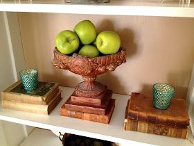
One of my favorite design aesthetics is the use of old books...they don't have to be rare editions...I am not a collector of that kind of treasure...they don't even have to be written on subjects I am interested in...they just have to look good in my design scheme (okay I guess I'll own my superficiality on that one)...

I think mixing old books among modern design is one of the quickest ways to give a space some soul....
(Merci':ShellsontheBeach)
 (Merci':Vogue)
(RuedeEmily)
(Merci':ViriGoodDesign.com)
(RuedeEmily)
(Merci':ImagineraryEnemy)
(RuedeEmily)
(RuedeEmily)
(Merci': CinnamonSwirls)
(RuedeEmily)
(Merci': fromoldbooks.org)
(RuedeEmily)
just don't go too crazy with your book collecting or your space will look like this before you know it....;)


Love the books with the flowers....so pretty. and believe it or not I actually saw, in a Show House, a staged display like your last picture! It was "done" with careful placement, but it was done to look like the look in that picture!!!
ReplyDelete